Kruithof optiek
True character, for everyone to see
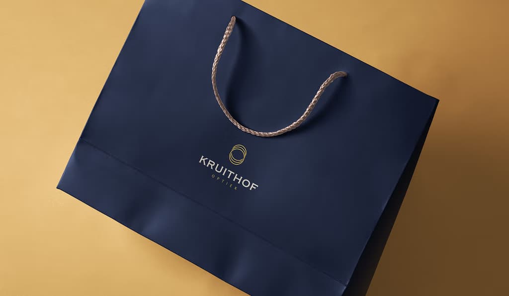
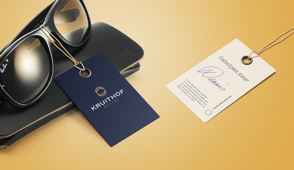
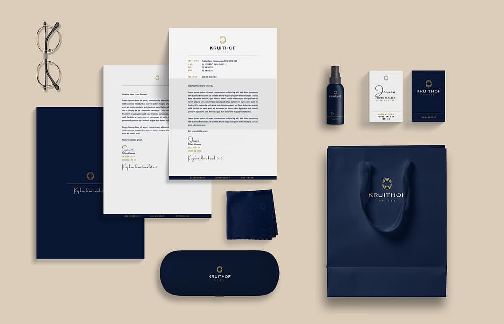
Brand Identity
Logo Design
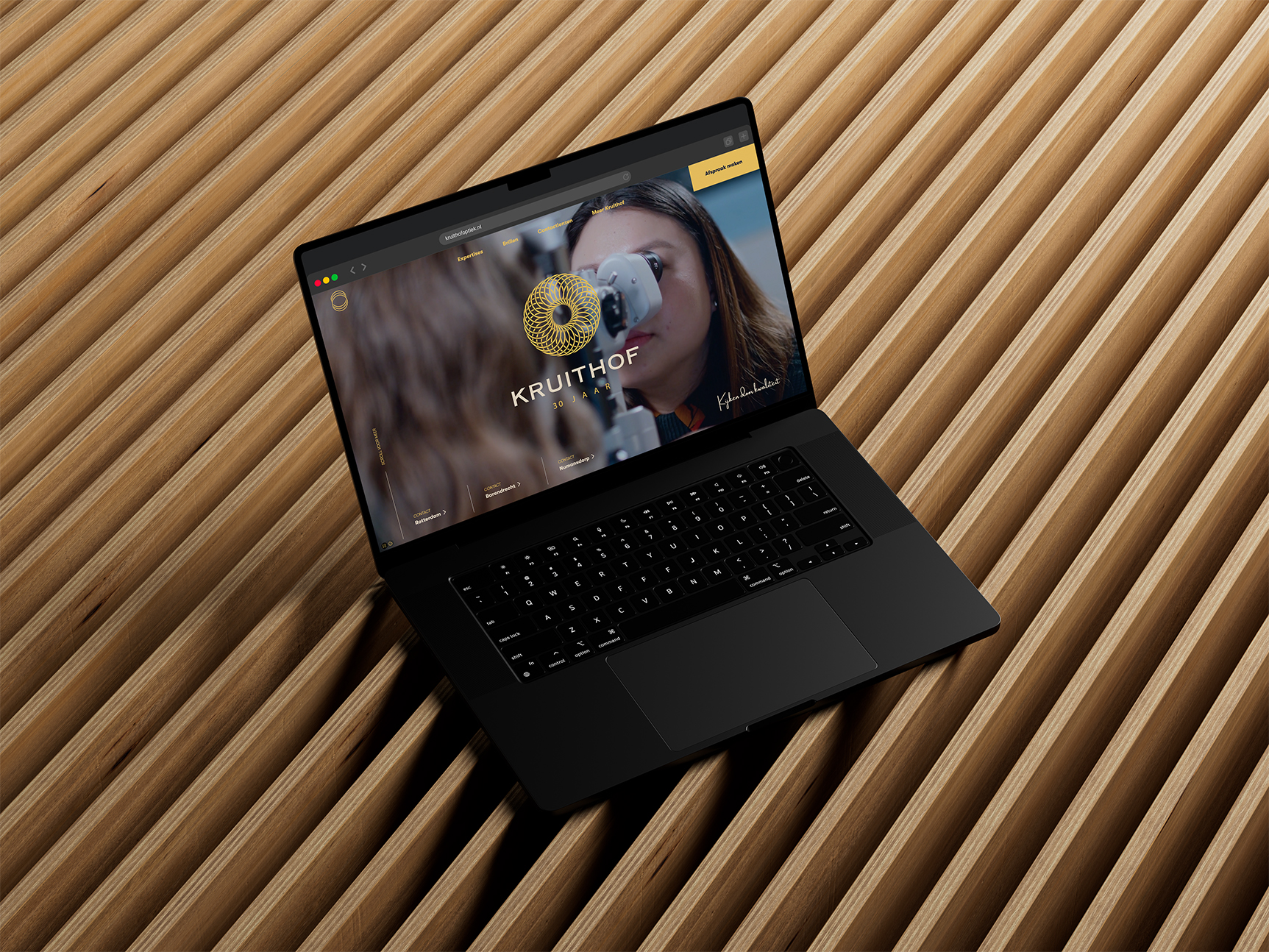
Communication concepting
Clear, concise & consistent
From three locations in the Netherlands, and with a reputation built on craftsmanship, precision and genuine attention, Kruithof Optiek is a trusted name in personalised vision care. Having created their branding and website earlier, we were now asked to develop a clear, concise and consistent brand story that makes it easy to understand why Kruithof is the natural choice for people who want only the very best for their eyes.

G2
Capturing the eye of the brand
After years of steady growth, Kruithof wanted to tell their story with more clarity and emotional depth. Their communication was solid, but missed the essence of what makes them stand out: exceptional craftsmanship, in-house expertise and the kind of genuine, personal care you rarely find today. The challenge was to shape a narrative that captures the true eye of the brand and could support future online and offline campaigns, all without losing the warmth and personal attention Kruithof is known for.
Default
Long-term creative foundation
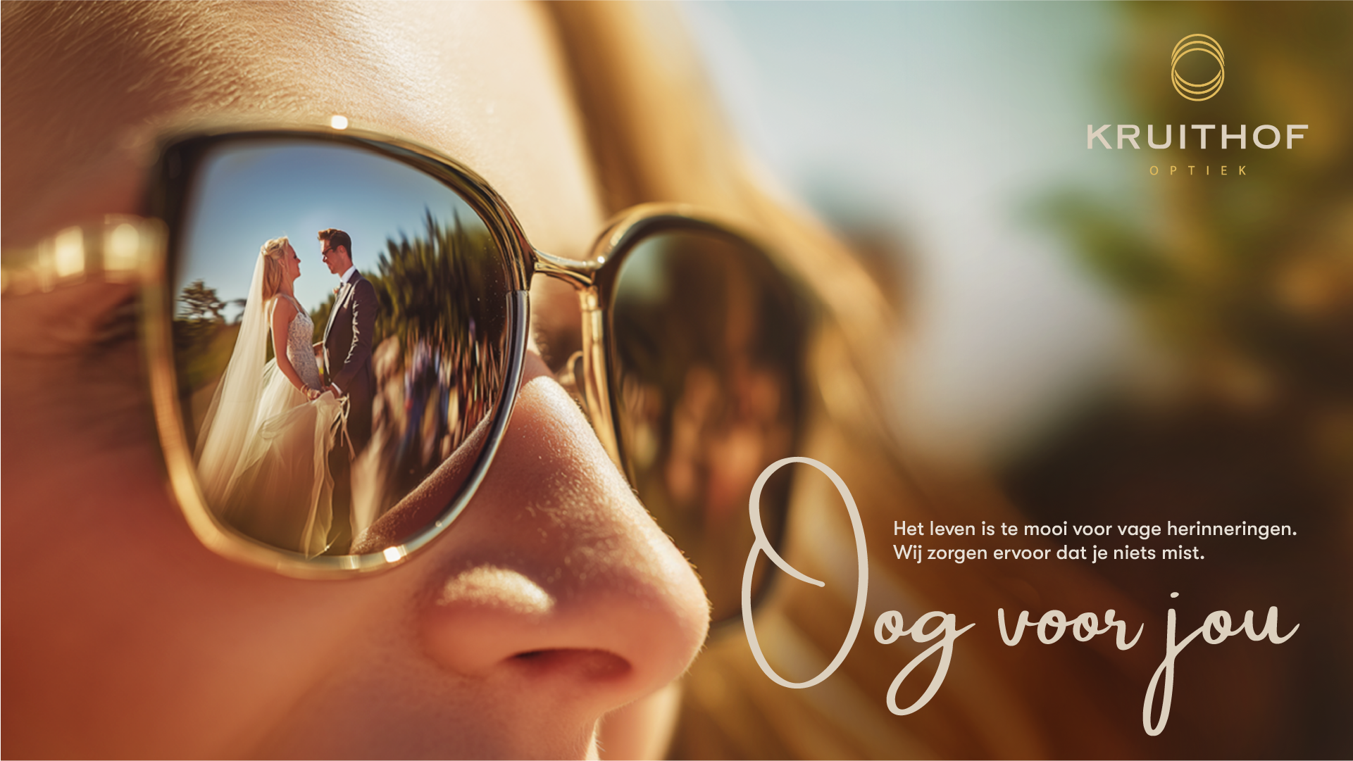
We redefined Kruithof’s positioning, wrote a unified brand story, and created a tagline that embodies everything the brand stands for: Oog voor jou. Building on this long-term creative foundation, we developed the campaign concept Oog voor wat telt, a first series of ads capturing life’s most meaningful moments reflected in someone’s glasses. From a child’s first steps to a long-awaited graduation ceremony, the 2025 campaign celebrates the moments that deserve to be seen. By refining structure, tone and messaging across all communication, we translated Kruithof’s values into a single, emotionally resonant narrative that works just as effectively online as offline.
Default
Future proof framework
Once again, we delivered on our promise. Kruithof now has a clear brand story and communication framework to support growth for years to come. The original, emotionally engaging messaging highlights their craftsmanship and personal attention while providing a structured foundation for future campaigns. Internally, it created alignment and confidence, and externally, it strengthened recognition and trust. Having partnered with a beautiful brand like Kruithof for years, shaping this next chapter together felt both natural and rewarding.
Default
“We love the personal, relaxed vibe of working with the Smaac team.”
Arie Kruithof & Jeffrey Kruithof
-
Owners
Kruithof optiek
smaac maker
To celebrate Kruithof’s 30th anniversary, we created a distinctive jubilee logo and a special magazine that highlights their heritage, values, and in-house expertise. Made out of 30 circles, the logo winks to their history while signalling a forward-looking vision, and the magazine brought the brand story to life. We went to town on designing the right layouts, visuals and editorial style to make Kruithof stand out in the optics industry. More than a celebration, we took it as a golden opportunity to connect with clients, suppliers and peers alike, and reinforce Kruithof’s reputation for craftsmanship, care, and innovation.


Default


G1
Initially, we were only looking for a new agency, but we ended up being supported with a new visual identity, brand story, and marketing materials. Far more than we had anticipated, and we are thrilled with the result. Smaac showed us why our previous identity didn’t fit, why our communication needed to change, and how our voice could be stronger. We are proud of the final outcome. Beyond all the content that was created, the best part of the collaboration was the genuine interest and connections that developed.
Arie Kruithof & Jeffrey Kruithof
Owners
-
Kruithof optiek
No items found.


.jpg)